Table of Contents
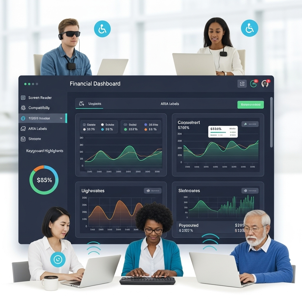
Financial dashboards have become essential tools for data-driven decision making, yet accessibility considerations often receive insufficient attention during development. This oversight not only excludes users with disabilities but also creates potential compliance risks. For React-based financial dashboards, implementing accessibility isn’t merely a compliance checkbox; it’s an opportunity to improve usability for all users. My experience in analyzing numerous system deployments underscores this critical point.
The Accessibility Imperative for Financial Tools
Financial dashboards present unique accessibility challenges stemming from their information density, interactive nature, and critical business function. Several factors make accessibility particularly important for these applications. Regulatory requirements are a key driver, as financial institutions often face explicit accessibility obligations under regulations like the Americans with Disabilities Act (ADA) or equivalents in other jurisdictions. The diverse user base in finance includes individuals with various disabilities who require accessible tools to perform their jobs effectively. Furthermore, complex visualizations, typical in financial data display, require special consideration for non-visual access. Finally, the high-stakes interactions common with these dashboards, which often support critical business decisions, mean that misinterpretation due to accessibility barriers could have significant consequences. These factors create both legal and practical imperatives for thorough accessibility implementation. Isn’t it clear that we can’t afford to overlook this?
Semantic Structure and Navigation
React’s component-based architecture facilitates proper semantic structure when properly implemented. Ensuring navigable dashboard experiences involves several key practices. A proper heading hierarchy is foundational; dashboard sections should be structured using appropriate heading levels (h1 through h6) that reflect the logical organization of content. This enables screen reader users to navigate between sections efficiently. For example, instead of generic divs for titles, semantic sectioning is better:
// Poor implementation
<div className="dashboard-section">
  <div className="section-title">Revenue Analysis</div>
  {/* Content */}
</div>

// Accessible implementation
<section>
  <h2>Revenue Analysis</h2>
  {/* Content */}
</section>
Using HTML5 semantic elements like <main>, <nav>, and <section> to create landmark regions also assists keyboard and screen reader navigation. Focus management is another critical area, as React’s virtual DOM can complicate it. Explicit focus control should be implemented for modal dialogs, expandable sections, and dynamic content updates using refs and useEffect:
const modalRef = useRef(null);

useEffect(() => {
  if (isModalOpen && modalRef.current) {
    modalRef.current.focus();
  }
}, [isModalOpen]);
Lastly, providing skip links allows users to bypass repeated navigation elements, which is particularly important for keyboard users accessing dense financial dashboards:
<a href="#main-content" className="skip-link">
  Skip to main dashboard
</a>
Accessible Data Visualizations
Financial charts and graphs present particular challenges for non-visual users. Several approaches help make these visualizations more accessible. Providing text alternatives is essential; this means offering textual summaries of key insights from each visualization. Rather than simply describing the chart type, the focus should be on the business implications and notable patterns.
<div aria-hidden="true">
  {/* Visual chart component */}
  <BarChart data={revenueData} />
</div>
<div className="sr-only">
  Quarterly revenue shows 15% year-over-year growth with strongest performance in Q3. Technology sector revenue increased 24% while financial services declined 3%.
</div>
Ensuring keyboard accessible data points allows individual data points to be accessed via keyboard navigation, with appropriate announcements for screen reader users.
<ChartPoint
  tabIndex={0}
  onKeyDown={handleKeyNavigation}
  aria-label="March 2024: $1.2M revenue, 18% above forecast"
/>
Offering data tables as alternatives by providing toggleable tabular representations of visual data can offer row and column navigation that is more naturally accessible to assistive technologies. Additionally, interactive legends must be keyboard navigable and properly labeled to allow users to filter or highlight specific data series.
Forms and Interactive Controls
Financial dashboards frequently include filtering, parameter selection, and other interactive controls. Several practices ensure these remain accessible. Explicit labels are paramount; always associate form controls with visible labels using the htmlFor attribute rather than relying on placeholder text or adjacent text.
<div className="filter-control">
  <label htmlFor="date-range">Reporting Period</label>
  <select id="date-range" onChange={handleDateChange}>
    {/* Options */}
  </select>
</div>
Appropriate ARIA attributes should be used when standard HTML semantics don’t suffice, particularly for custom React components.
<div
  role="combobox"
  aria-expanded={isOpen}
  aria-haspopup="listbox"
  aria-labelledby="account-select-label"
>
  {/* Custom dropdown implementation */}
</div>
Communicating error states accessibly involves using aria-invalid and associated error messages.
<input
  type="text"
  aria-invalid={hasError}
  aria-describedby="amount-error"
/>
{hasError && (
  <div id="amount-error" className="error-message">
    Please enter a valid monetary amount
  </div>
)}
Finally, state changes for dynamic controls should be clearly announced using aria-live regions for important updates that don’t receive focus.
<div aria-live="polite" className="sr-only">
  {statusMessage}
</div>
Color and Contrast
Financial dashboards often use color to convey meaning, which can create challenges for users with color vision deficiencies. Maintaining sufficient contrast is key: at least a 4.5:1 contrast ratio for text and 3:1 for UI components and graphical objects. For financial data where precision is critical, aiming for enhanced contrast of 7:1 is a good practice. Redundant coding is also important; never rely solely on color to convey information. Instead, supplement with patterns, icons, or text labels.
<div className={`status-indicator ${status}`}>
  {/* Add icon and text, not just color */}
  {status === 'positive' && <> ↑ Positive </>}
  {status === 'negative' && <> ↓ Negative </>}
</div>
Using color-blind safe palettes, such as Viridis and Okabe-Ito, which are well-tested for data visualizations, helps ensure charts remain distinguishable to users with various forms of color blindness. (A small detail, but one that makes a world of difference for some users!)
Performance Considerations
Accessibility and performance often share implementation concerns, particularly important for data-heavy financial dashboards. For instance, long financial tables benefit from virtualized lists using libraries like react-window or react-virtualized, which improve performance while maintaining accessibility when properly implemented. Throttled updates are useful for rapid data updates to prevent excessive screen reader announcements while ensuring critical information remains accessible. Furthermore, progressive enhancement, structuring applications to remain functional even when JavaScript temporarily fails, ensures core financial data remains accessible.
Testing Approach
Comprehensive testing forms a critical part of accessibility implementation. Automated testing tools like jest-axe or cypress-axe can integrate accessibility testing into development workflows. An example with jest-axe might look like this:
// Example with jest-axe
import { axe } from 'jest-axe';

it('should not have accessibility violations', async () => {
  const { container } = render(<FinancialDashboard />);
  const results = await axe(container);
  expect(results).toHaveNoViolations();
});
However, automated tools aren’t foolproof. Screen reader testing with tools like NVDA, JAWS, and VoiceOver is essential, as it reveals issues automated testing might miss, particularly for complex data visualizations. Keyboard navigation testing is also crucial to ensure all dashboard functions remain accessible without a mouse, especially for drill-down analysis and detailed data exploration. A perspective forged through years of navigating real-world enterprise integrations suggests that this hands-on testing is irreplaceable.
Building truly accessible financial dashboards requires thoughtful implementation throughout the development process, not just as a final review step. When accessibility becomes a core design consideration, the resulting dashboards serve a broader user base while often improving usability for everyone.
Note: The code examples in this article demonstrate concepts but may require additional implementation details in production environments.