The power generation sector operates within a uniquely complex environment, influenced by fluctuating fuel costs, variable demand, intricate grid dynamics, diverse generation sources (renewables, fossil fuels, nuclear), and evolving regulatory landscapes. Standard financial reports often struggle to capture this dynamism. My research highlights the critical need for specialized financial dashboards that provide real-time, integrated views of operational and financial performance, enabling better decision-making in this volatile industry. How else can executives effectively navigate generation mix optimization or hedging strategies?
Designing an effective dashboard for power generation requires focusing on sector-specific Key Performance Indicators (KPIs). These might include:
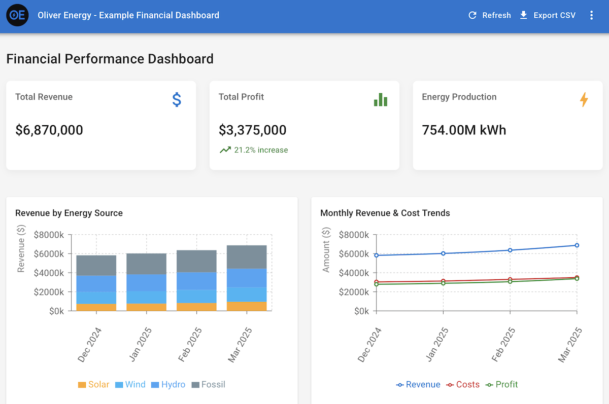
- Generation Metrics: Output (MWh) by source, capacity factor, fuel consumption efficiency, real-time grid price comparisons.
- Revenue & Cost Analysis: Revenue per MWh, fuel cost pass-through, Power Purchase Agreement (PPA) performance tracking, operations and maintenance (O&M) expenses per unit, spark/dark spreads.
- Risk & Hedging: Mark-to-market on hedge positions, Value-at-Risk (VaR) calculations for commodity price exposure, counterparty risk summaries.
- Operational Efficiency: Plant availability, forced outage rates, maintenance schedule adherence and cost tracking.
Visualizing these metrics effectively is crucial. Time-series charts are essential for tracking generation, pricing, and costs. Geographic maps can visualize asset locations overlaid with weather patterns or grid constraints. Stacked bar charts or waterfall diagrams can break down revenue and cost components, while specialized charts might visualize complex hedging portfolios or PPA contract structures. Interactivity is key, allowing users to drill down into specific assets, time periods, or fuel types.
The choice of technology depends on complexity and integration needs. Power BI and Tableau provide powerful platforms for integrating data from various sources (like SCADA systems, Energy Trading and Risk Management (ETRM) platforms, and financial ERPs) and creating sophisticated, interactive dashboards suitable for many analytical needs. However, for highly specialized requirements, such as integrating real-time market data feeds or building predictive models directly into the dashboard interface, a custom solution using React combined with visualization libraries (like D3.js or Nivo) offers unparalleled flexibility. This approach allows for bespoke visualizations and integration logic tailored precisely to the energy sector’s nuances.
The primary challenge often lies in data integration. Pulling consistent, timely data from diverse operational and financial systems requires robust data warehousing and ETL processes. Data quality must be rigorously maintained, as decisions based on flawed data can have significant financial consequences in this capital-intensive industry. Governance around metric definitions and data ownership is also vital.
Ultimately, well-designed financial dashboards empower power generation companies to move beyond reactive reporting. They provide the forward-looking insights needed to optimize generation assets, manage market risks effectively, allocate capital efficiently, and ensure regulatory compliance in an increasingly complex energy landscape. It’s about transforming data streams into actionable intelligence for navigating the currents of the energy market.