Table of Contents
Revisiting Dashboard Design Through an Investment Lens
Remember my April 15th analysis on crafting effective financial dashboards for the power generation sector? The core ideas (clarity, focus, guiding the user) hold true across different domains. To illustrate this, I want to walk through another dashboard example I’ve developed: PortfolioLens. This time, we’re applying those design principles to the often complex world of investment portfolio visualization.
So, What Exactly is PortfolioLens?
PortfolioLens isn’t a commercial product, but rather a conceptual dashboard designed to visualize investment portfolios from multiple useful angles. The goal? To demonstrate how dense financial data can be presented intuitively, leading to actionable insights without drowning the user in a sea of numbers. It’s all about making the complex digestible.
My approach organizes portfolio information into logical sections, allowing users to drill down naturally:
- Portfolio Overview: This is the entry point (a clean, high-level snapshot. Think total portfolio value, overall return (both absolute and time-weighted), and perhaps a key benchmark comparison right upfront. It answers the immediate “How am I doing?” question.
- Holdings Breakdown: Next, we need transparency. This section provides a clear, sortable list of every asset held) stocks, bonds, ETFs, mutual funds, maybe even alternatives. Key data points like quantity, current price, market value, cost basis, and unrealized gain/loss are crucial here. Good filtering options are a must.
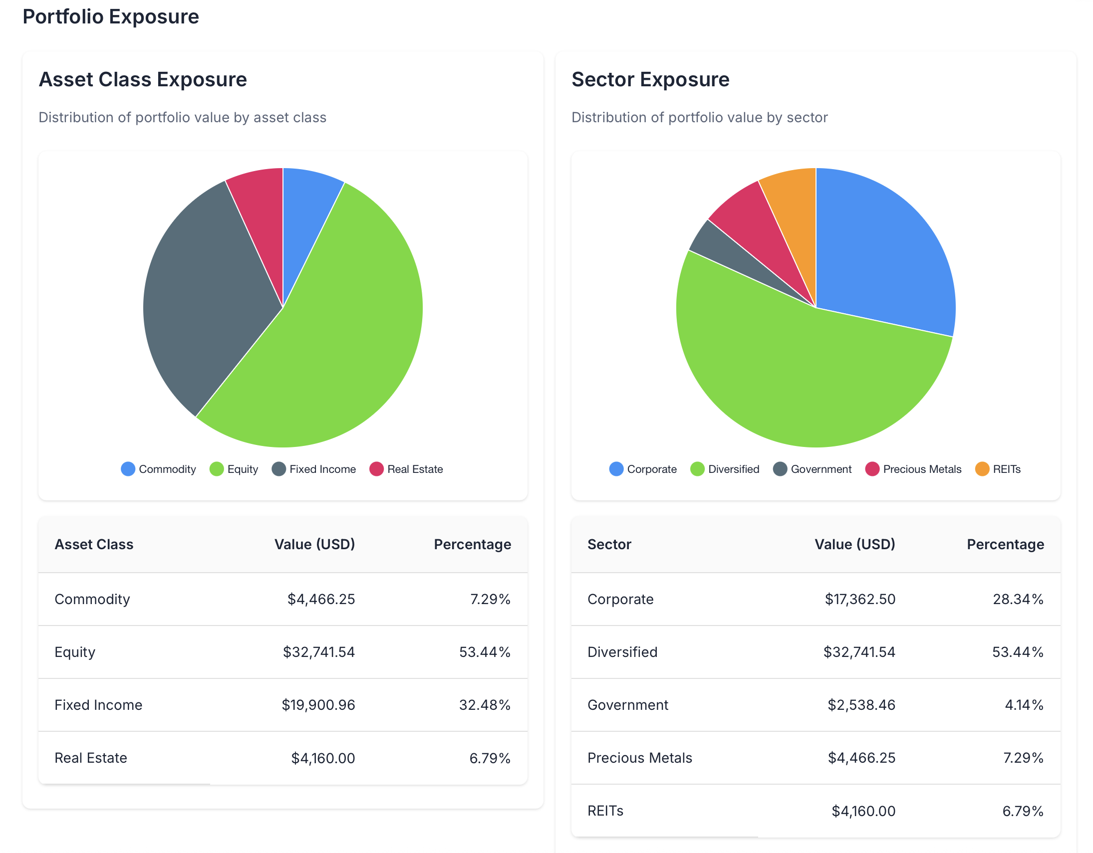
- Exposure Visualizations: This is where visualization really shines. Instead of just listing assets, we show the bigger picture of the portfolio’s composition. Typical views include:
- Asset Class Allocation: Pie charts or treemaps showing the mix (equities, fixed income, cash, etc.). Essential for diversification checks.
- Geographic Distribution: A map-based view or chart showing where investments are domiciled. Highlights geopolitical concentration risk.
- Sector Exposure: Breakdown by industry sector (tech, healthcare, financials…). Reveals thematic bets or unintended concentrations.
- Currency Breakdown: Important for international investors to understand FX risk.
- Risk Assessment: Numbers without context are just noise. Here, we introduce risk metrics. Value at Risk (VaR) is common, showing potential loss under normal market conditions over a set period (e.g., 95% confidence VaR over 1 day). Crucially, VaR needs explanation; it’s not a worst-case scenario, just a probabilistic one. Other metrics like standard deviation or Sharpe ratio could also feature here.
- Scenario Analysis: This moves beyond historical data to explore “what ifs.” How might the portfolio perform under different market shocks (e.g., interest rate hikes, oil price spikes, specific market downturns)? Visualizing potential outcomes helps stress-test the strategy and manage expectations.
Why Bother With This Level of Detail?
Dashboards like PortfolioLens aren’t just fancy reporting tools; they directly support better investment decisions. For investors and advisors, the practical applications are numerous: getting a rapid grasp of diversification, spotting hidden risks like sector over-concentration, clearly communicating strategy to clients, testing out investment ideas via scenario modeling, and ensuring the portfolio stays aligned with long-term goals. It turns data overload into focused understanding.
Tech Choices: Flexibility Matters
I built the PortfolioLens example using React for the frontend and PostgreSQL for the backend data store. This stack offers great flexibility for custom interactions and unique visualizations. However, let’s be realistic (not everyone needs or wants a fully custom solution.
The good news is that the core concepts translate beautifully to mainstream business intelligence tools like Power BI or Tableau. For many organizations already invested in these platforms, they offer significant advantages:
- Data Connectivity: Built-in connectors to countless financial data sources (market data providers, brokerage APIs, internal databases).
- Ease of Use: Drag-and-drop interfaces speed up visualization creation, reducing reliance on developers for every change.
- Automation: Scheduled data refreshes ensure the dashboard reflects near real-time information.
- Security & Sharing: Robust features for controlling access and securely distributing dashboards to stakeholders.
Power BI, for instance, excels at interactive geographic mapping, making it great for visualizing regional exposure. Tableau, on the other hand, often gets the nod for its powerful analytical capabilities, which lend themselves well to sophisticated scenario modeling. The tool is often less important than the design thinking behind how information is presented.
Core Design Principles Revisited
Building PortfolioLens reinforced some key design takeaways for financial dashboards:
- Progressive Disclosure: Don’t hit users with everything at once. Start high-level (the overview) and let them drill into details (holdings, exposures) as needed. Keep the initial view clean.
- Visual Consistency: Use color codes consistently. If equities are blue in the asset allocation chart, they should be blue everywhere else. This reduces cognitive load. Same goes for fonts, axes, and labeling.
- Context is King: Performance metrics mean little in isolation. Always show them alongside relevant benchmarks (e.g., S&P 500 for US equities) or target returns.
- Interaction is Key: Static charts are less useful. Allow users to filter by date range, asset type, or other relevant dimensions. Tooltips providing extra detail on hover are also invaluable.
- Communicate Risk Clearly: Risk metrics like VaR can be easily misinterpreted. Provide clear labels, explanations (perhaps in a small info icon), and avoid implying false precision.
The Goal: Decision Support, Not Data Dumping
Ultimately, the most effective dashboards prioritize decision support over raw data display. Complexity isn’t the goal; clarity is. By organizing information logically and presenting it visually, even relatively straightforward dashboards can unlock powerful insights.
Whether you’re tracking wind turbine output or navigating stock market volatility, the fundamentals of good dashboard design) guiding the user towards understanding and action, remain remarkably consistent.
How do you visualize financial data? Are there specific dashboard features you find indispensable? Let’s discuss over on LinkedIn.